Building Showbit’s Scalable Design System
Streamlining Design Processes through an Integrated Design System

Overview
In today's fast-paced digital landscape, maintaining consistency and efficiency in design processes is crucial for businesses striving to deliver exceptional user experiences. This case study explores how Stockbit, a leading financial technology firm, implemented an integrated design system to streamline its design processes and enhance collaboration across teams. Making Stockbit consistent, centralized, and human-centric with a Universe of Stockbit Design System.
Why Design System Needed?
There are many benefits of a Design System. It helps the entire company deliver better and more consistent design solutions efficiently. A Design System eases out the process of designing delightful experiences for end-users. To maintain:
Facilitates Consistency
Better Communication
Clarity to Developers
Efficiency
Team Work
Atomic Design
Atomic Design is methodology created by Brad Frost seeking to provide direction on building interface design systems more deliberately and with explicit order and hierarchy.
Atoms
Just like in Chemistry, atoms are the smallest building blocks in our system. In design we have buttons, inputs, labels and other small elements that get used throughout our design.
Molecules
Its a combination of multiple atoms. Each atom has carried its unique properties into a group that on it’s own has district characteristics.
Organism
As we enter the Organism stage, our collections of atoms and molecules now become more complex than at the molecular level.
Style Guide
Colors
The can reflect the personality of your brand. They can attract users, and the can better communicate your message. Any UI Design guidelines are likely to mention colors prominently. Color can set the basic mood, tone, concept, and connotation for a brand or product.
Text Colors
Artboard Colors
Modal Colors

Feature and Shade Colors
Typography
The Spacing System
Grid

All spacing for components and typography is done in increments of 4 pixels, either spaced vertically or horizontally. But to allow more flexibility than for certain cases the designer can use multiples of 2 pixels such as 10px, 18px, 22px, and so on.
These forms are the basic unit of measurement for spacing
Common Corner Radius
The shape corner radius can be subtle or more significant. Shapes can be used to reflect a specific purpose or meaning. Shape both helps users identify components and affects how usable they are.
Adjustment and Exceptions
Full page modals commonly found in Bibit Apps and Android Native in Stockbit Apps.
For full page modals, don’t use corner radius and modals indicator. Use close icon and/or chevron left icon inside top bar to replace the modals indicator function to close modals or back to the 1st modals layer.
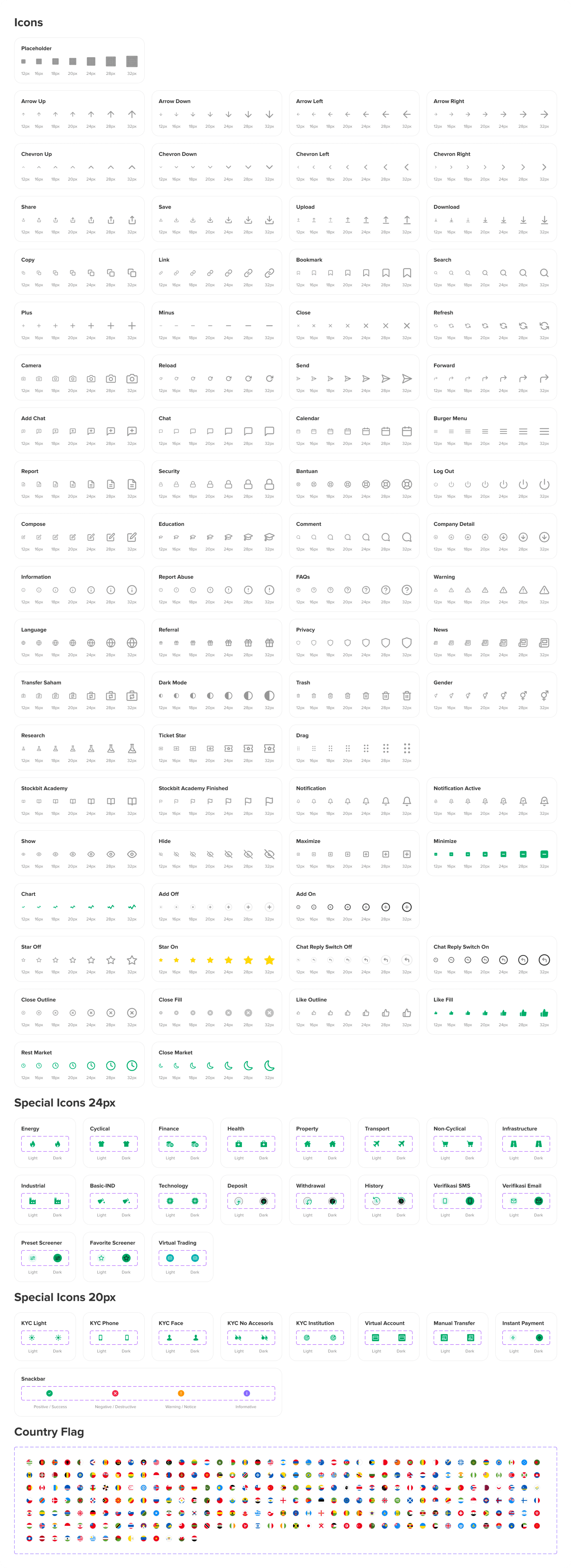
Icons
Icons are images or symbols that represent spesific actions or tools in an interface. To achieve harmony for an icon family, we need to maintain the same stylistic rules throughout, 1.5 px centered stroke and grid for 24x24 icon size.
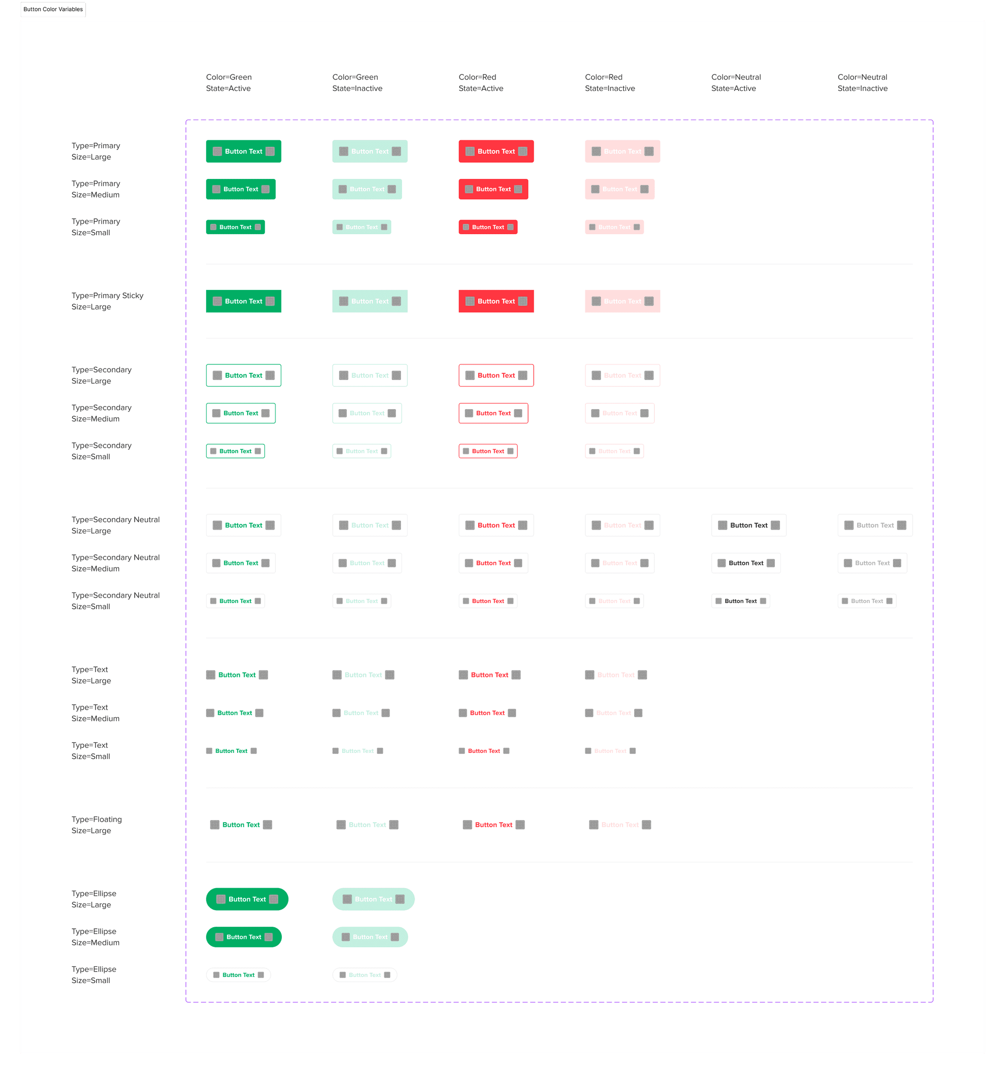
Buttons
Buttons are usually styled links to attract users and drive them in a specific direction. Through buttons, we can link to other pages or finish task like a form submission or buying online.
Text Field
Text fields allow users to enter text into a UI. They typically appear in forms and dialogs. Text field component design should provide a clear affordance for interaction, makin the fields discoverable in layouts, efficient to fill in, and accessible.